Regression model
Hi there! today we will build a multilayer model. Lets import the necessary components.
from keras.models import Sequential
from keras.layers import Dense, Activation
from keras.utils import plot_model
Before going further, its better to understand the difference between Regression and Classification. Regression is to predict any continous form. Classification is to predict any discrete form. Keras give this option of metrics which can be used accordingly for Regression and Classification. We can provide metrics using metircs keyword. Lets do lab4.py. Make an empty lab4.py file. First we explore Keras Regression Metrics. Mean Squared Error: mean_squared_error, MSE or mse. Mean Absolute Error: mean_absolute_error, MAE, mae. Mean Absolute Percentage Error: mean_absolute_percentage_error, MAPE, mape. Cosine Proximity: cosine_proximity, cosine. Ddd this to lab4.py.
from numpy import array
from keras.models import Sequential
from keras.layers import Dense
from matplotlib import pyplot
lets prepare the input data. X = array([1, 2, 3, 4, 5, 6, 7, 8, 9, 10]). lets create model.
model = Sequential()
model.add(Dense(2, input_dim=1))
model.add(Dense(1))
model.compile(loss='mse', optimizer='adam', metrics=['mse', 'mae', 'mape', 'cosine'])
Lets see how this model looks like and train the model. The input sample is only one containing 10 elements and the output is 1.
from keras.utils import plot_model
plot_model(model, to_file='mymodel.png', show_shapes=True)
History = model.fit(X, [1], epochs=Epochs, batch_size=len(X), verbose=2)
History object gets returned by the fit method of models, So lets plot it.
pyplot.plot(history.history['mean_squared_error'],label='mse')
pyplot.plot(history.history['mean_absolute_error'],label='mae')
pyplot.plot(history.history['mean_absolute_percentage_error'],label='mape')
pyplot.plot(history.history['cosine_proximity'],label='cosine')
pyplot.legend()
pyplot.show()
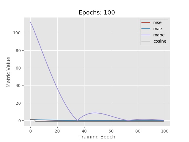
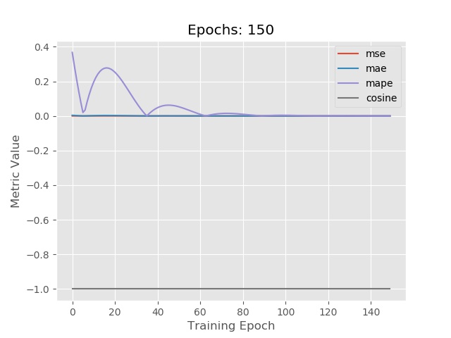
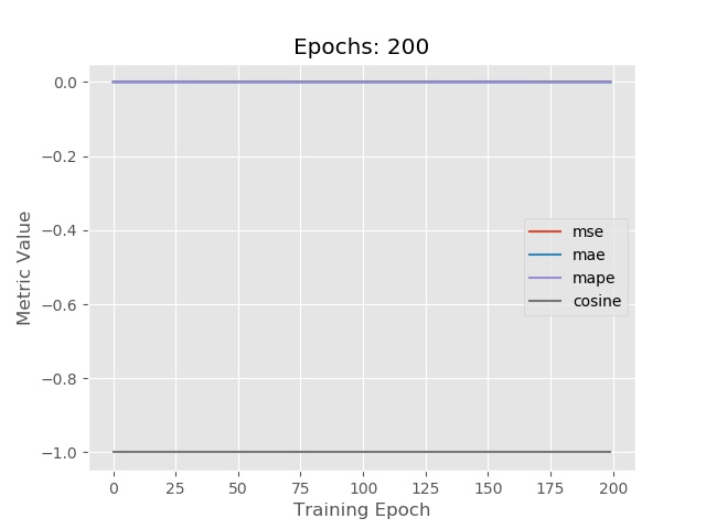
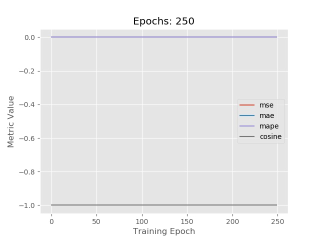
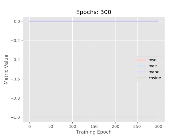
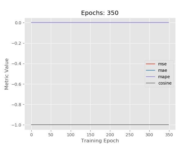
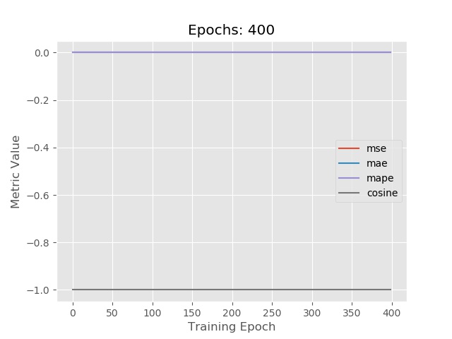
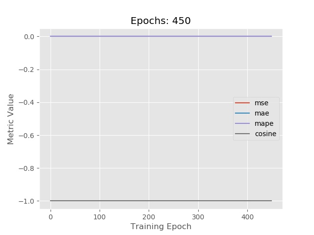
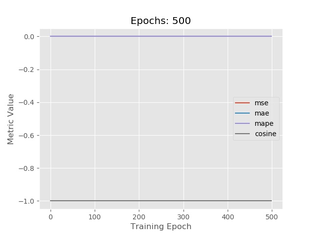
You see that during the training process based on the metrics the model is trained. It checks the error for each epoch and train the model. Run it twice to see the difference. Lets save it as a .jpg image. This can only save one image one time.
pyplot.savefig('Spring.jpg')
So lets do some trick here. Define a variable Epochs and use it as below.
for i in range(10):

	Epochs+=50
	history = model.fit(X, [1], epochs=Epochs, batch_size=len(X), verbose=2)

	pyplot.title('Epochs: {}'.format(Epochs))
	pyplot.plot(history.history['mean_squared_error'],label='mse')
	pyplot.plot(history.history['mean_absolute_error'],label='mae')
	pyplot.plot(history.history['mean_absolute_percentage_error'],label='mape')
	pyplot.plot(history.history['cosine_proximity'],label='cosine')
	pyplot.xlabel('Training Epoch')
	pyplot.ylabel('Metric Value')
	pyplot.legend()
	pyplot.savefig('Spring-epochs-{}.jpg'.format(Epochs))

	pyplot.close()
Here are some results. Thats all for this lab 4.
!
!
!
!
!
!
!
!
!
! Enjoyed this post? Never miss out on future posts by following us 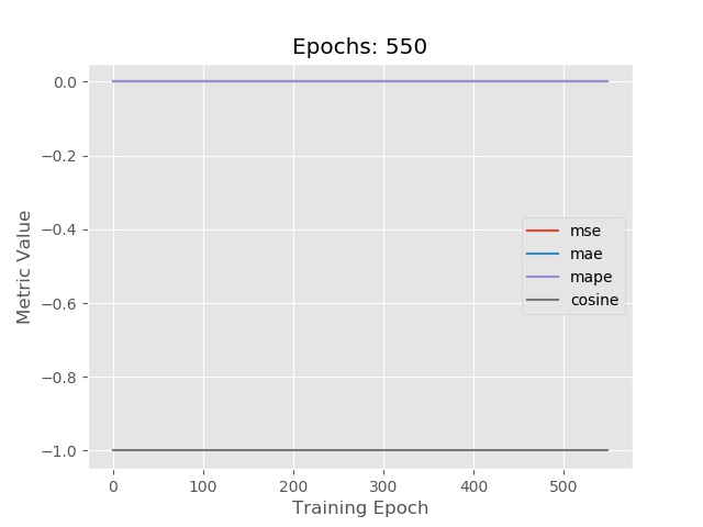 In the next lab 5 we will learn about training the model for Classification. I hope this lab will be helpful for the beginners. Code is available.