Learn HTML and CSS in a Single Post: Complete Tutorial From Semantic Markup to Flexbox, Grid, and Responsive Design
HTML is the structure of every web page; CSS is how it looks. Together they’re the foundation of all frontend development — and unlike frameworks that come and go, the core has been stable for two decades. This single post teaches both in five stages, with hand-drawn diagrams and runnable snippets you can paste into a .html file and open in a browser.
Learning Roadmap
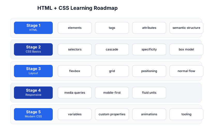
The roadmap moves from HTML structure (Stage 1), through CSS fundamentals (Stage 2), to layout (Stage 3), responsive design (Stage 4), and modern CSS + tooling (Stage 5).
Stage 1 — HTML: Structure
A minimal page
<!DOCTYPE html>
<html lang="en">
<head>
  <meta charset="UTF-8">
  <meta name="viewport" content="width=device-width, initial-scale=1.0">
  <title>My Page</title>
  <link rel="stylesheet" href="style.css">
</head>
<body>
  <h1>Hello, HTML!</h1>
  <p>This is a paragraph.</p>
  <script src="app.js"></script>
</body>
</html>
<!DOCTYPE html> triggers standards mode. <head> holds metadata (title, charset, viewport, stylesheet links — not shown on the page); <body> holds the visible content. The viewport meta tag is mandatory for responsive design on mobile.
Elements, tags, attributes
- Element — a piece of content wrapped in tags:
<p>text</p>. Most elements have opening and closing tags; a few are void (self-closing):<img>,<br>,<input>,<meta>,<link>. - Attributes — key/value pairs on the opening tag:
<a href="...">,<img src="..." alt="...">,<input type="text" required>. - Nesting — elements contain elements; the result is a tree.
Semantic HTML
Use elements that describe meaning, not appearance. Semantic HTML helps accessibility (screen readers), SEO (search engines understand structure), and maintainability:
| Semantic | Use for |
|---|---|
<header> / <footer> | page or section header/footer |
<nav> | navigation links |
<main> | the main content (one per page) |
<article> | a self-contained composition (a blog post, a card) |
<section> | a thematic grouping |
<aside> | tangentially related (sidebar, ad) |
<h1>–<h6> | headings (one <h1> per page) |
<figure> / <figcaption> | an image with a caption |
<time> | a date/time |
Avoid <div> and <span> when a semantic element fits — they carry no meaning. Use them only as generic containers for styling.
From HTML to the DOM
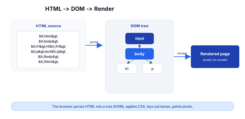
The browser parses your HTML into a tree called the DOM (Document Object Model), then applies CSS, lays out boxes, and paints pixels. JavaScript manipulates the DOM; DevTools (the Elements panel) shows it live. Every “frontend bug” is ultimately about the DOM, the CSS applied to it, or the layout it produces.
Stage 2 — CSS Basics
Selectors and the cascade
CSS targets elements with selectors and applies declarations (property: value):
/* element selector */
p { color: #333; }

/* class (.name) — reusable */
.button { padding: 8px 16px; }

/* id (#name) — unique, high specificity, avoid for styling */
#hero { background: #f0f0f0; }

/* descendant */
nav a { text-decoration: none; }

/* pseudo-class (state) */
a:hover { color: blue; }
input:focus { border-color: blue; }

/* combinators */
h1 + p { margin-top: 0; }   /* adjacent sibling */
.list > li { ... }           /* direct child */
Specificity
When two rules target the same element, specificity decides which wins — not “which comes later.” The score is (inline, IDs, classes/attrs/pseudo-classes, elements):
*→ 0,0,0,0p→ 0,0,0,1.button→ 0,0,1,0#hero→ 0,1,0,0style="..."(inline) → 1,0,0,0!important→ overrides everything (avoid)
Pitfall: “My CSS isn’t applying!” is almost always a specificity loss or a typo in the selector. Use the DevTools Elements panel — it shows every rule applied to an element and which won, with the losers struck through. Don’t reach for
!important; fix the specificity.
The box model
Every element is a box with four layers:
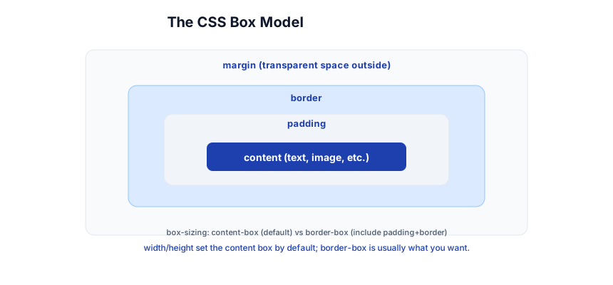
- content — the text/image itself.
- padding — space inside the border (background fills this).
- border — the line around padding.
- margin — space outside the border (transparent; collapses with neighbors).
.box {
  width: 200px;
  padding: 20px;
  border: 2px solid #333;
  margin: 16px;
  box-sizing: border-box;   /* width INCLUDES padding + border */
}
Pitfall: By default,
widthsets the content box, sowidth: 200px+padding: 20px+border: 2px= 244px wide — surprises everyone. Setbox-sizing: border-boxglobally (*, *::before, *::after { box-sizing: border-box; }) sowidthincludes padding and border. It’s the first line of every modern stylesheet.
Stage 3 — Layout
Normal flow
Without CSS, elements stack in normal flow: block elements (<div>, <p>, <h1>) stack vertically and take full width; inline elements (<span>, <a>, <strong>) flow like text. display changes this: display: block, inline, inline-block (inline but accepts width/height).
Flexbox (1D layout)
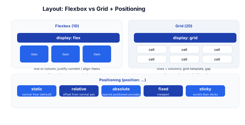
Flexbox lays items in one direction (a row or column) and aligns them. It’s the default for navbars, card rows, and centering.
.nav {
  display: flex;
  justify-content: space-between;  /* main axis: spread items */
  align-items: center;             /* cross axis: vertically center */
  gap: 16px;
}
.nav .logo { margin-right: auto; }  /* push the rest to the right */
Key properties: flex-direction (row/column), justify-content (main-axis alignment), align-items (cross-axis alignment), gap (spacing between items), flex (grow/shrink on children). The modern centering one-liner: .parent { display: grid; place-items: center; } or .parent { display: flex; align-items: center; justify-content: center; }.
CSS Grid (2D layout)
Grid lays items in two dimensions (rows and columns). Use it for page layouts and dashboards:
.page {
  display: grid;
  grid-template-columns: 200px 1fr;   /* sidebar + flexible main */
  grid-template-rows: auto 1fr auto;
  gap: 16px;
  min-height: 100vh;
}
1fr is “one fraction of the remaining space”; auto sizes to content. grid-template-areas lets you name regions for a visual layout. Rule of thumb: Grid for page-level 2D structure, Flexbox for 1D component layout.
Positioning
position takes an element out of normal flow:
| Value | Behavior |
|---|---|
static (default) | normal flow |
relative | offset from its normal position; keeps its space |
absolute | positioned relative to nearest positioned ancestor; removed from flow |
fixed | positioned relative to the viewport (stays on scroll) |
sticky | normal flow until it hits a threshold, then sticks (sticky headers) |
Pitfall:
position: absolutewithout a positioned ancestor positions relative to the viewport-ish root, surprising everyone. Setposition: relativeon the parent you want it anchored to.
Stage 4 — Responsive Design
The viewport meta tag
<meta name="viewport" content="width=device-width, initial-scale=1.0">
Without this, mobile browsers render the desktop layout at ~980px and zoom out — tiny and unusable. This tag makes the layout match the device width.
Media queries
/* base: mobile-first (smallest screens) */
.card { grid-template-columns: 1fr; }

/* tablets and up */
@media (min-width: 600px) {
  .card { grid-template-columns: 1fr 1fr; }
}

/* desktops */
@media (min-width: 900px) {
  .card { grid-template-columns: repeat(3, 1fr); }
}
Mobile-first means the base styles target small screens and min-width queries add complexity for larger ones. It’s simpler and faster on mobile (less CSS to override) than desktop-first with max-width.
Fluid units
%— relative to the parent.vw/vh— 1% of viewport width/height.rem— relative to the root font size (scales with user zoom; prefer for text and spacing).em— relative to the element’s own font size (cascades; tricky for spacing).clamp(min, ideal, max)— fluid value with bounds:font-size: clamp(1rem, 2.5vw, 2rem).
h1 { font-size: clamp(1.5rem, 5vw, 3rem); }   /* grows with viewport, bounded */
img { max-width: 100%; height: auto; }         /* never overflow container */
Pitfall: Hardcoded
width: 800pxoverflows on phones. Usemax-width+ relative units so content shrinks to fit. Test by resizing the browser window to ~360px wide — your layout should survive.
Stage 5 — Modern CSS + Tooling
Custom properties (CSS variables)
:root {
  --brand: #2563eb;
  --space: 16px;
  --radius: 8px;
}
.button {
  background: var(--brand);
  padding: var(--space);
  border-radius: var(--radius);
}
.button:hover { background: color-mix(in srgb, var(--brand), black 10%); }
Variables cascade (override in a scope), theme dynamically ([data-theme="dark"] { --brand: #58a6ff; }), and reduce duplication. This site’s own dark theme uses them — see the categories page fix for a real example.
Transitions and animations
.button { transition: background 0.2s ease, transform 0.2s ease; }
.button:hover { background: #1e40af; transform: translateY(-1px); }

@keyframes spin { to { transform: rotate(360deg); } }
.spinner { animation: spin 1s linear infinite; }
transition smoothly interpolates between states; @keyframes define multi-step animations. Respect users who prefer reduced motion: @media (prefers-reduced-motion: reduce) { * { animation: none !important; transition: none !important; } }.
The toolchain
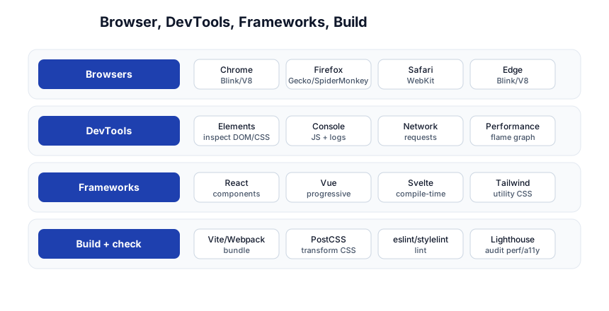
- Browsers: Chrome (Blink/V8), Firefox (Gecko), Safari (WebKit) — test in all three; they render differently.
- DevTools: Elements (inspect DOM/CSS live), Console (JS), Network (requests), Performance (flame graph).
F12/Cmd+Opt+I. The Elements panel is your primary debugging tool. - Frameworks: React/Vue/Svelte (component-based JS frameworks that generate HTML), Tailwind (utility-class CSS), Bootstrap (component CSS).
- Build + check: Vite/Webpack (bundle + dev server), PostCSS (transform CSS — autoprefixer, nesting), ESLint/Stylelint (lint), Lighthouse (audit performance + accessibility).
Accessibility (a11y)
Good HTML is mostly accessible by default: use semantic elements, real <button>/<a> (not <div onclick>), alt on images, label on inputs, sufficient color contrast (4.5:1 for text). Test with the keyboard (Tab through) and a screen reader. Lighthouse scores accessibility automatically.
Quick-Start Checklist
- Write a minimal page —
<!DOCTYPE html>, head with viewport, body, link a CSS file. Open it in a browser. - Use semantic HTML —
<header>,<nav>,<main>,<article>,<h1>–<h6>over<div>. - Set
box-sizing: border-boxglobally — it’s the first line of your CSS. - Learn selectors + specificity — and debug with the DevTools Elements panel, not
!important. - Center things with Flexbox/Grid —
display: grid; place-items: center;. - Use Grid for 2D page layout, Flexbox for 1D components.
- Make it responsive — viewport meta,
max-width+ relative units, mobile-first media queries. - Use CSS variables for colors, spacing, radii — theme by overriding in a scope.
- Test in Chrome, Firefox, Safari and at 360px width.
- Run Lighthouse — it audits performance, accessibility, and SEO in one click.
Common Pitfalls
- No viewport meta tag — the page is unusably tiny on mobile. Always include it.
widthwithoutbox-sizing: border-box— padding + border make the box bigger than expected. Set border-box globally.!importantto force a style — a specificity loss you’re patching; fix the selector instead.<div onclick>instead of<button>— breaks keyboard navigation and screen readers. Use real interactive elements.- Hardcoded px widths — overflow on small screens. Use
max-width+ relative units. position: absolutewithout a positioned parent — anchors to the wrong reference. Setposition: relativeon the intended parent.- Forgetting
alton images — fails accessibility and SEO. Decorative images getalt="". - Desktop-first media queries — more CSS to override on mobile; go mobile-first with
min-width. - Low color contrast — text on a low-contrast background is unreadable; aim for 4.5:1.
Further Reading
- MDN Web Docs — the authoritative HTML/CSS reference
- web.dev — Google’s modern web guidance (CSS, performance, a11y)
- CSS Tricks — practical CSS recipes and almanac
- Flexbox Froggy — learn Flexbox with a game
- Grid Garden — learn Grid with a game
- The CSS spec (W3C) — when you need the source of truth
Related guides
HTML/CSS is the foundation of all web work — these PyShine tutorials build on it:
- Learn JavaScript + TypeScript in One Post — JS manipulates the DOM this post describes; the two are inseparable.
- Learn REST API in One Post — the frontend fetches data from these APIs.
- Learn Computer Networking in One Post — HTTP, the browser, and the request lifecycle under every page load.
- Learn SQL in One Post — the data behind most pages.
- Learn Bash in One Post —
curl, build scripts, and the CLI around your frontend tooling.
HTML and CSS are unusual in tech: the fundamentals you learn today will still be valid in twenty years. The five stages here — structure, styling, layout, responsive, modern — cover everything you need to build any web page, and the frameworks (React, Vue, Tailwind) are all conveniences on top of these primitives. Spend a day per stage, build a real page (a portfolio, a blog), resize the browser to 360px, run Lighthouse, and fix what it flags. The skills only stick once you’ve fought a layout into working at every width — so open a text file and start. Enjoyed this post? Never miss out on future posts by following us