Learn Tailwind CSS in a Single Post: Complete Tutorial From Utility Classes to Responsive Components
Tailwind CSS is a utility-first CSS framework: instead of predefined component classes (.btn, .card), you compose styles from small, single-purpose utility classes directly in your markup (p-4, text-lg, flex, rounded-md). It sounds verbose, but it removes the naming, the dead CSS, and the “where does this style live?” hunt — and a JIT engine ships only the classes you actually use. This single post teaches the whole framework in five stages, with hand-drawn diagrams and runnable snippets.
Learning Roadmap
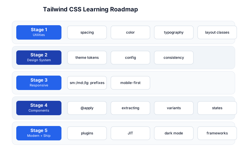
The roadmap moves from utilities (Stage 1), through the design system (Stage 2), to responsive design (Stage 3), components and reuse (Stage 4), and modern + shipping (Stage 5). You’ll want the HTML/CSS fundamentals first — Tailwind is CSS, not a replacement for understanding it.
Stage 1 — Utilities
What a utility is
A utility class does one thing. p-4 sets padding: 1rem. text-center sets text-align: center. You compose a complete style by stacking utilities in the class attribute:
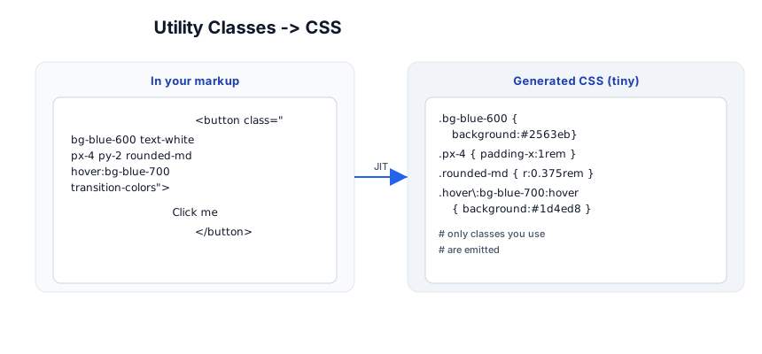
<button class="bg-blue-600 text-white px-4 py-2 rounded-md hover:bg-blue-700 transition-colors">
  Click me
</button>
The Tailwind JIT compiler scans your files, finds the classes you used, and emits only those CSS rules — no megabyte of unused framework CSS. The generated stylesheet for a real app is often 10–20 KB.
The utility families
| Family | Examples |
|---|---|
| Spacing | p-4 (padding), m-2 (margin), gap-4, px-6 py-3, mt-8 |
| Color | bg-blue-600, text-gray-700, border-red-300, bg-white/80 (80% opacity) |
| Typography | text-lg, font-bold, leading-relaxed, tracking-wide, text-center |
| Layout | flex, grid, grid-cols-3, block, hidden, items-center, justify-between |
| Sizing | w-full, h-screen, max-w-md, min-h-0, w-1/2 |
| Borders / radius | border, border-2, rounded-lg, rounded-full, ring-2 ring-blue-500 |
| Effects | shadow-md, opacity-50, blur-sm, transition-colors, duration-200 |
The spacing scale
Tailwind’s spacing scale is the source of its consistency: every p-*, m-*, gap-*, w-*, h-* uses the same scale, where the number is a multiple of 0.25rem (4px). So p-4 = 16px, p-8 = 32px, gap-2 = 8px. This means spacing always feels harmonious — you can’t accidentally pick an off-scale value.
Pitfall: Resist
p-[13px](arbitrary values) unless you have a real reason. The power of Tailwind is the constrained scale — arbitrary values break the visual rhythm. Use the scale; extend it in config if you need a new step.
Stage 2 — The Design System
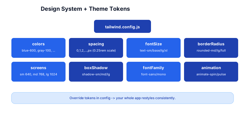
Tailwind isn’t a random set of classes — it’s a design system generated from a config file. Every color, spacing step, font size, and breakpoint is a token you can inspect and override.
tailwind.config.js
/** @type {import('tailwindcss').Config} */
module.exports = {
  content: ["./src/**/*.{js,jsx,ts,tsx,html}"],   // where to scan for classes
  theme: {
    extend: {
      colors: {
        brand: { 500: '#2563eb', 600: '#1d4ed8', 700: '#1e40af' },
      },
      fontFamily: {
        sans: ['Inter', 'system-ui', 'sans-serif'],
      },
      borderRadius: {
        '4xl': '2rem',
      },
    },
  },
  plugins: [],
};
Use extend to add tokens without clobbering the defaults; use the top-level key to replace them. Override colors.brand and bg-brand-600, text-brand-700, border-brand-500 all become available — your whole app restyles consistently by changing one token.
Why this matters
A design system in config means: one source of truth, no magic hex codes scattered across components, and a guarantee that p-4 means the same thing everywhere. The constraints are the feature — they make your UI look designed, not assembled.
Pitfall: If every component hand-picks hex colors and pixel values, you’ve reinvented ad-hoc CSS with extra steps. Define your brand tokens once in config, then use only them.
Stage 3 — Responsive Design
Tailwind is mobile-first: base (unprefixed) classes apply at all sizes, and sm:/md:/lg:/xl:/2xl: prefixes apply at that breakpoint and up (min-width).
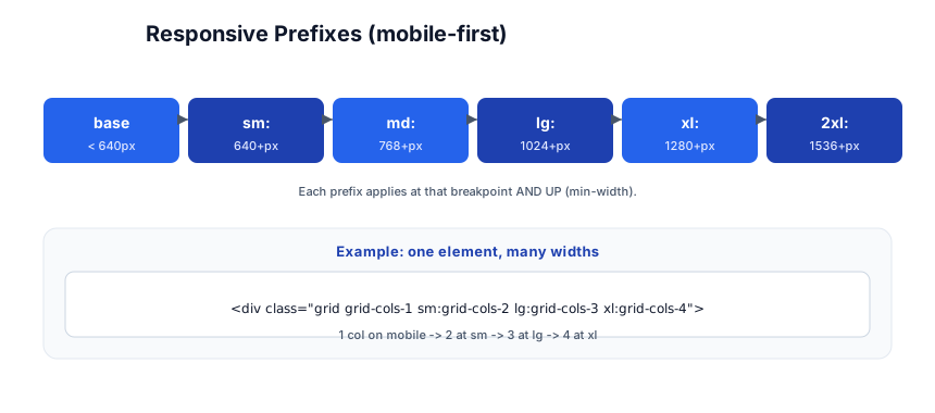
<div class="grid grid-cols-1 sm:grid-cols-2 lg:grid-cols-3 xl:grid-cols-4 gap-4">
  <!-- 1 column on mobile, 2 at ≥640px, 3 at ≥1024px, 4 at ≥1280px -->
</div>
| Prefix | Breakpoint |
|---|---|
| (none) | all sizes |
sm: | ≥ 640px |
md: | ≥ 768px |
lg: | ≥ 1024px |
xl: | ≥ 1280px |
2xl: | ≥ 1536px |
You read a class list left-to-right as “mobile gets this, then larger screens override.” text-sm md:text-base lg:text-lg = small text on mobile, medium on tablets, large on desktops.
Pitfall: The instinct from old CSS is desktop-first (
max-widthqueries). In Tailwind, think mobile-first: write the mobile styles bare, then addsm:/md:to enhance for bigger screens. It produces smaller, simpler class lists.
Arbitrary variants and breakpoints
Need a one-off breakpoint? min-[960px]:grid-cols-3 works. But prefer extending the config’s screens for any breakpoint you use more than once.
Stage 4 — Components
The “long class list” concern
The classic objection to Tailwind is “my class lists are huge and ugly.” Two answers: (1) in practice, a button’s class list is shorter than a separate .btn CSS file + the HTML class; (2) when a pattern repeats, extract a component.
@apply — use utilities in CSS
/* components.css */
@tailwind base;
@tailwind components;
@tailwind utilities;

.btn-primary {
  @apply bg-blue-600 text-white px-4 py-2 rounded-md hover:bg-blue-700 transition-colors;
}
@apply pulls utility styles into a named class. Use it sparingly — the Tailwind team’s guidance is to extract to a JS/TSX component instead, which keeps styles co-located with the markup and avoids a separate CSS file.
Extracting a component (React example)
function Button({ children, variant = 'primary' }) {
  const base = 'px-4 py-2 rounded-md transition-colors font-medium';
  const variants = {
    primary: 'bg-blue-600 text-white hover:bg-blue-700',
    ghost:   'bg-transparent text-blue-600 hover:bg-blue-50',
  };
  return <button className={`${base} ${variants[variant]}`}>{children}</button>;
}
This is the idiomatic Tailwind + component-framework pattern: a small JS component holds the class list, and variant maps handle the alternatives. No CSS file, no naming.
Variants and states
State prefixes work like responsive ones — they apply the utility only in a state:
| Prefix | When |
|---|---|
hover: | mouse over |
focus: | keyboard focus |
active: | pressed |
disabled: | disabled |
group-hover: | when a parent .group is hovered |
peer-checked: | when a sibling .peer is checked |
dark: | dark color scheme |
<div class="group">
  <button class="bg-blue-600 group-hover:bg-blue-700">Hover the card</button>
</div>
group-* and peer-* are powerful — they style an element based on a parent’s or sibling’s state, without JS.
Dark mode
<html class="dark">
<body class="bg-white dark:bg-gray-900 text-black dark:text-white">
dark: applies when a dark class is on an ancestor (or, configured to media, when the OS is in dark mode). The class strategy lets a toggle switch themes instantly.
Stage 5 — Modern + Ship
The JIT engine
The Just-In-Time compiler (the default since v3) scans your content paths and generates only the classes present. Benefits: tiny CSS, arbitrary values (top-[117px]), arbitrary variants, and instant feedback. Always set content correctly — missing files means missing styles.
Pitfall: Dynamically constructed class names (
class="bg-${color}-600") don’t work — the JIT can’t see them at scan time. Use a lookup map (const colors = { blue: 'bg-blue-600', red: 'bg-red-600' }) so the full strings appear in source.
Plugins
| Plugin | Adds |
|---|---|
@tailwindcss/forms | consistent form input styles |
@tailwindcss/typography | the prose class for long-form content (blogs!) |
@tailwindcss/aspect-ratio | responsive aspect-ratio boxes |
@tailwindcss/line-clamp | (built-in since v3.3) multi-line ellipsis |
| custom plugin | your own utilities or components |
plugins: [require('@tailwindcss/typography'), require('@tailwindcss/forms')],
Framework integration
Tailwind works with any framework: React/Next.js, Vue/Nuxt, Svelte, Astro. The setup is the same: install, create a config, add the directives to your CSS, import that CSS. For Vite there’s an official @tailwindcss/vite plugin for the fastest build.
UI kits on top
- Headless UI — accessible, unstyled components (dropdowns, modals, tabs) you style with Tailwind.
- shadcn/ui — copy-paste component code (not a package) built on Tailwind + Radix.
- daisyUI — adds component classes (
.btn,.card) on top of Tailwind for those who want them.
The ecosystem
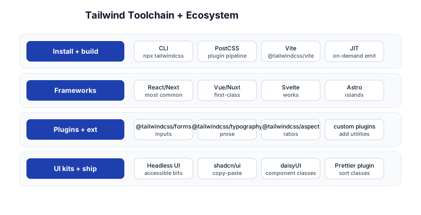
| Concern | Tool |
|---|---|
| Install + build | CLI, PostCSS, Vite plugin, JIT |
| Frameworks | React/Next, Vue/Nuxt, Svelte, Astro |
| Plugins | forms, typography, aspect-ratio, custom |
| UI kits | Headless UI, shadcn/ui, daisyUI |
| Tooling | Prettier plugin (sorts class lists), the VS Code IntelliSense extension |
The Prettier plugin (prettier-plugin-tailwindcss) sorts class lists into a canonical order — it makes a messy class="..." readable and consistent across a team. Install it early.
Quick-Start Checklist
- Install in your project —
npm i -D tailwindcss,npx tailwindcss init, setcontentpaths, add the three@tailwinddirectives to your CSS. - Learn the spacing scale — it’s
n × 0.25rem;p-4= 16px. Most of Tailwind is this scale. - Use the color tokens —
bg-blue-600,text-gray-700; override your brand in config, then use only tokens. - Go mobile-first — bare classes for mobile,
sm:/md:/lg:to enhance. - Extract repeated patterns into a JS component (or
@applyfor non-JS projects). - Use
group-hover:/peer-checked:for state-driven styling without JS. - Add
dark:variants for a theme toggle; putclass="dark"on<html>. - Install the Prettier plugin to sort class lists.
- Never dynamically build class strings — use a lookup map so the JIT sees them.
- Set
contentcorrectly — it’s where the JIT scans; miss a path, miss the styles.
Common Pitfalls
- Missing
contentpaths — the JIT doesn’t scan a file, so its classes don’t generate. Always list every source path. - Dynamic class names (
bg-${color}-600) — invisible to the JIT. Use a static lookup map. - Overusing arbitrary values (
p-[13px]) — breaks the scale’s consistency; extend the config instead. - Hand-picking hex colors instead of tokens — you’ve reinvented ad-hoc CSS. Define brand tokens.
- Desktop-first thinking — write mobile bare, enhance with
sm:/md:, not the reverse. - Reaching for
@applytoo eagerly — prefer a JS component; co-locate styles with markup. - Forgetting
dark:/ state prefixes exist — they replace reams of CSS you’d otherwise write. - Not using the Prettier plugin — unsorted class lists are hard to read and diff.
Further Reading
- Tailwind CSS Docs — the official, excellent reference
- Tailwind Labs YouTube — short, official screencasts
- Headless UI — accessible unstyled components
- shadcn/ui — copy-paste component code
- awesome-tailwindcss — curated resources
Related guides
Tailwind is the styling layer of the modern frontend — these PyShine tutorials pair with it:
- Learn HTML + CSS in One Post — Tailwind is CSS; know the box model, flex/grid, and specificity it abstracts.
- Learn React + Next.js in One Post — the framework where Tailwind class lists live (in
className). - Learn JavaScript + TypeScript in One Post — the logic layer; variant maps and component props.
- Learn REST API in One Post — what your styled frontend fetches.
- Learn Docker in One Post — ship the built static assets in a container.
Tailwind’s tradeoff is explicit: it moves the “what does this look like” decision into the markup, which feels noisy at first and fast once it’s muscle memory. The five stages here — utilities, the design system, responsive, components, modern + ship — cover everything from a button to a full themed, responsive app. Spend a day per stage, style a real page (a landing page, a dashboard) with only Tailwind, toggle dark mode, and resize to 360px. The constraint of the token scale is what makes the result look designed — so lean into it, don’t fight it with arbitrary values. Open a project, run Enjoyed this post? Never miss out on future posts by following us npx tailwindcss init, and start.