Introduction
Meta has open-sourced Astryx, the design system that has powered over 13,000 internal applications across the company for the past eight years. Astryx ships with more than 150 accessible React components, full TypeScript support, and a unique agent-ready architecture that makes it equally usable by human developers and AI coding assistants. Built on React and StyleX – Meta’s own CSS-in-JS library – Astryx brings battle-tested UI infrastructure to the open source community under the MIT license.
What sets Astryx apart from other design systems is its deliberate focus on flexibility and ownership. Rather than locking developers into a specific styling paradigm, Astryx works alongside Tailwind CSS, CSS Modules, and plain CSS. Its swizzle feature lets you eject any component’s source code directly into your project, giving you full ownership and the ability to customize without maintaining a fork. With seven ready-made themes and CSS custom property overrides, Astryx makes it straightforward to match any brand identity.
The project has already garnered over 7,163 stars on GitHub, with 5,247 stars gained in just the past week – a testament to the community’s excitement about bringing Meta-grade design infrastructure to the open source world. Currently in Beta, Astryx is actively seeking contributors and feedback as it matures toward a stable release.
Architecture Overview
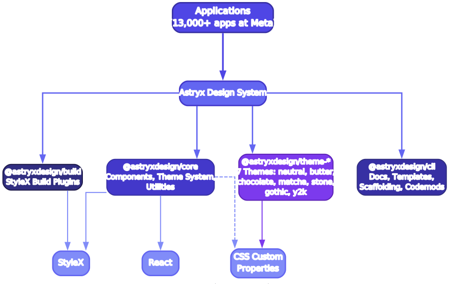
The Astryx architecture is organized as a monorepo containing several coordinated packages that work together to deliver a cohesive design system experience. At the foundation sits the @astryxdesign/core package, which houses the 150+ React components, each built with accessibility as a first-class concern and fully typed with TypeScript. These components are not simple wrappers around HTML elements; they encapsulate complex interaction patterns, keyboard navigation, ARIA attributes, and focus management that would take significant effort to implement from scratch.
On top of the core components, Astryx layers its theming system through dedicated theme packages such as @astryxdesign/theme-neutral, @astryxdesign/theme-butter, and so on for each of the seven built-in themes. Each theme package provides a complete set of design tokens – colors, spacing, typography, border radii, and shadows – that map to CSS custom properties. This means themes are not just color swaps; they represent fully considered visual identities with appropriate contrast ratios and spatial relationships.
The @astryxdesign/cli package provides the command-line interface that serves dual purposes: it helps human developers discover and integrate components, and it exposes a structured API that AI agents can programmatically query. When you run npm run astryx -- component --list, the CLI returns a machine-readable catalog of every available component, its props, and its theme compatibility. This agent-ready design means that AI coding assistants can understand what components exist, how to use them, and which themes are available – all without scraping documentation.
The @astryxdesign/build package handles the build tooling, ensuring that components are tree-shakeable and that only the code you actually use ends up in your production bundle. This is critical for performance: even though Astryx ships 150+ components, your application only pays the size cost for the ones you import. The build pipeline also handles StyleX compilation, transforming CSS-in-JS declarations into optimized, collision-free class names at build time rather than runtime.
Finally, the architecture supports the swizzle workflow through the CLI. When you swizzle a component, the CLI copies that component’s full source code into your project directory, allowing you to modify it directly. Your local version takes precedence over the package version, so you maintain full ownership without needing to fork the entire repository. This architecture ensures that Astryx scales from quick prototyping with defaults all the way to fully customized production applications.
Key Features
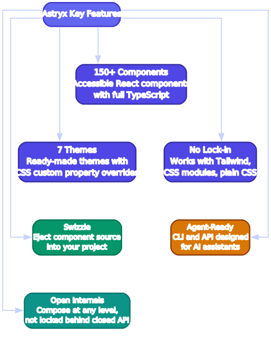
Astryx delivers a comprehensive set of features that address the real-world challenges of building consistent, accessible user interfaces at scale. The following sections break down each major feature area and explain why it matters for your development workflow.
150+ Accessible React Components – Astryx provides one of the largest open source component libraries available, covering everything from foundational elements like buttons, inputs, and checkboxes to complex composite components like data tables, date pickers, modals, and navigation systems. Every component is built with accessibility at its core: proper ARIA roles, keyboard navigation support, focus trapping for modals, and screen reader announcements are all handled out of the box. This means you can ship interfaces that meet WCAG guidelines without needing to be an accessibility expert.
Full TypeScript Support – Every component ships with comprehensive TypeScript type definitions. Props are fully typed, generic components preserve type information through their APIs, and the type definitions are included directly in the package rather than distributed separately through DefinitelyTyped. This gives you intelligent autocomplete, compile-time error checking, and self-documenting component APIs directly in your editor.
Built on StyleX – Astryx uses StyleX, Meta’s CSS-in-JS library, as its styling foundation. StyleX compiles styles at build time rather than runtime, producing minimal, collision-free class names. This eliminates the performance overhead typically associated with CSS-in-JS solutions while retaining the developer experience benefits of co-located styles. StyleX also enables deterministic style resolution, meaning you never encounter specificity conflicts between components.
Seven Ready-Made Themes – Astryx ships with seven distinct themes: neutral, butter, chocolate, matcha, stone, gothic, and y2k. Each theme is a complete visual identity with carefully chosen color palettes, spacing scales, and typographic hierarchies. You can use these themes directly, use them as starting points for customization, or create entirely new themes using CSS custom property overrides.
No Styling Lock-In – Unlike many design systems that require you to adopt their styling approach, Astryx is designed to coexist with your existing CSS strategy. Whether your project uses Tailwind CSS, CSS Modules, plain CSS, or another CSS-in-JS library, Astryx components work alongside them without conflicts. This makes it practical to adopt Astryx incrementally in existing projects.
Swizzle for Full Ownership – The swizzle feature is Astryx’s answer to the “vendor lock-in” problem that plagues many design system adopters. When you need to customize a component beyond what its props and theme tokens allow, you can swizzle it: the CLI copies the component’s complete source code into your project. From that point forward, you own that code and can modify it however you see fit, while still receiving updates for all other components.
Agent-Ready Architecture – Astryx’s CLI, API, and documentation are designed to be consumed by both humans and AI assistants. The structured component catalog, machine-readable prop definitions, and clear usage patterns make it straightforward for AI coding agents to understand what components are available, how to compose them, and which theme tokens to apply. This is a forward-thinking approach that acknowledges the growing role of AI in software development.
Installation and Setup
Getting started with Astryx is straightforward. The core package provides all 150+ components, and you choose a theme package to define the visual identity of your application.
Installing with npm
npm install @astryxdesign/core @astryxdesign/theme-neutral
npm install -D @astryxdesign/cli
Installing with pnpm
pnpm add @astryxdesign/core @astryxdesign/theme-neutral
pnpm add -D @astryxdesign/cli
Installing with yarn
yarn add @astryxdesign/core @astryxdesign/theme-neutral
yarn add -D @astryxdesign/cli
After installing the packages, add the CLI script to your package.json:
"scripts": {
  "astryx": "node node_modules/@astryxdesign/cli/bin/astryx.mjs"
}
You can then list all available components using the CLI:
npm run astryx -- component --list
Basic Usage
Once installed, you can import and use components directly in your React application:
import { Button, TextInput, Card } from '@astryxdesign/core';
import '@astryxdesign/theme-neutral';

function App() {
  return (
    <Card>
      <TextInput label="Email" type="email" />
      <TextInput label="Password" type="password" />
      <Button variant="primary">Sign In</Button>
    </Card>
  );
}

export default App;
The theme import applies the design tokens globally via CSS custom properties, so all components automatically pick up the neutral theme’s visual identity. If you switch to a different theme package, only the import statement changes – your component code remains identical.
Swizzling a Component
When you need deeper customization than props and theme tokens allow, use the swizzle command to eject a component’s source code into your project:
npm run astryx -- swizzle Button
This copies the Button component’s source code into your project’s src/components/astryx/ directory. You can then modify it freely. Your local version takes precedence over the package version, so you maintain full ownership of the customized component while still receiving updates for all other Astryx components.
Theming System

Astryx’s theming system is built on a layered architecture that balances ease of use with deep customization capability. Understanding how the layers interact is essential for making the most of the design system, whether you are applying a built-in theme or crafting a completely custom visual identity.
The first layer is the design token specification. Every Astryx theme is defined by a set of design tokens: colors (primary, secondary, surface, error, warning, success), spacing scales (from 0 to 12 representing 0px to 64px), typography (font families, sizes, weights, line heights), border radii, shadows, and transition timings. These tokens are not arbitrary values; they are carefully calibrated to work together, ensuring that any combination of tokens produces a visually coherent result. The token specification acts as a contract between the theme and the components, guaranteeing that every component can find the values it needs.
The second layer is the CSS custom property mapping. When you import a theme package like @astryxdesign/theme-neutral, it registers a complete set of CSS custom properties on the :root element. Properties like --astryx-color-primary, --astryx-spacing-4, and --astryx-font-size-body are set to the theme’s token values. Astryx components reference these custom properties rather than hardcoded values, which means that changing a custom property value immediately updates every component that uses it. This is the mechanism that enables runtime theme switching and per-component customization without modifying any component source code.
The third layer is the theme package distribution. Each of the seven themes – neutral, butter, chocolate, matcha, stone, gothic, and y2k – is distributed as a separate npm package. This means you only install the themes you actually use, keeping your bundle lean. Switching themes is as simple as changing which theme package you import. The neutral theme provides a clean, professional look suitable for enterprise applications. Butter offers warm, approachable tones. Chocolate brings rich, earthy colors. Matcha uses calming green hues. Stone provides a muted, sophisticated palette. Gothic delivers a dark, high-contrast experience. And y2k embraces the playful, retro-futuristic aesthetic of the early 2000s.
The fourth layer is custom property overrides for custom themes. If none of the seven built-in themes match your brand, you do not need to fork Astryx or create a new theme package from scratch. Instead, you override the CSS custom properties in your own stylesheet. For example, to change the primary color across all components, you simply set --astryx-color-primary: #ff6600; in your CSS. This approach gives you the full power of theming without the overhead of maintaining a separate package. You can override individual tokens or redefine the entire token set – the choice is yours.
The fifth layer is the StyleX integration. While Astryx components use StyleX internally for their styles, the theming system bridges StyleX’s compiled class names with the CSS custom property layer. At build time, StyleX resolves component styles to class names that reference CSS custom properties. At runtime, the browser resolves those custom properties to the values defined by your active theme. This two-stage resolution means that StyleX’s build-time optimizations (dead code elimination, style deduplication, deterministic specificity) work in harmony with the dynamic theming capabilities of CSS custom properties.
Development Workflow
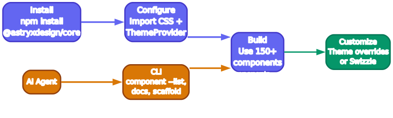
Astryx supports a development workflow that scales from rapid prototyping to fully customized production applications. The workflow is designed to minimize friction at every stage, letting you start quickly and progressively take on more complexity only when your project demands it.
Stage 1: Install and Import – The workflow begins with installing the core package and a theme, then importing components directly into your application. At this stage, you are using Astryx exactly as it ships: default components, default theme, default behavior. This is ideal for prototyping, hackathons, internal tools, or any situation where you need functional UI quickly. The components are accessible and well-typed out of the box, so even at this stage you are shipping quality interfaces.
Stage 2: Theme Selection and Token Overrides – As your project matures, you select the theme that best matches your brand and begin customizing design tokens through CSS custom property overrides. This stage requires no code changes to Astryx components – you simply add override rules in your own CSS. Want a different primary color? Override --astryx-color-primary. Need tighter spacing? Override the spacing tokens. This approach keeps your customizations separate from the component library, making it easy to update Astryx without losing your visual identity.
Stage 3: Swizzle for Deep Customization – When token overrides are not enough – perhaps you need to change a component’s internal structure, add new interactive states, or fundamentally alter its layout – you swizzle the component. The CLI copies the component source into your project, giving you complete control. Swizzled components live in your source tree, so they participate in your normal development workflow: your linter, your tests, your code review process. Meanwhile, all non-swizzled components continue to receive updates from the Astryx package.
Stage 4: AI-Assisted Development – Astryx’s agent-ready architecture shines at this stage. AI coding assistants can query the CLI to discover available components, understand their props and variants, and generate correct usage code. The structured API means that AI agents do not need to guess at component APIs or scrape documentation; they can programmatically access the same information that human developers see in the docs. This enables workflows where an AI agent scaffolds a new feature using Astryx components, and a human developer refines the result.
Stage 5: Contribute Back – If you find yourself swizzling many components or building a theme that others could use, Astryx welcomes contributions. The monorepo structure makes it easy to submit new themes, component improvements, or bug fixes through GitHub pull requests. Because Astryx is MIT licensed and open source, your contributions benefit the entire community. The project maintains clear contribution guidelines and a responsive maintainer team, making the process approachable for first-time contributors.
Throughout all five stages, the Astryx CLI serves as your companion. It lists available components, handles swizzle operations, validates theme token overrides, and provides the structured API that both human developers and AI agents rely on. The CLI is intentionally lightweight and fast, ensuring that it never becomes a bottleneck in your development process.
AI Agent Integration
One of Astryx’s most distinctive features is its agent-ready architecture. While most design systems are designed exclusively for human developers, Astryx explicitly supports AI coding assistants as first-class consumers of its API and documentation.
The CLI provides a structured, machine-readable output format that AI agents can parse to understand the full component catalog. When an AI agent runs the list command, it receives a structured response containing every component’s name, description, available variants, prop definitions, and theme compatibility. This eliminates the ambiguity that often occurs when AI assistants try to infer component APIs from unstructured documentation.
The swizzle workflow is also agent-accessible. An AI coding assistant can swizzle a component on behalf of a developer, copy the source code into the project, and then modify it according to the developer’s instructions. This enables a collaborative workflow where the AI handles the mechanical steps (finding the right component, copying it, applying standard customizations) while the human developer focuses on the creative and strategic decisions.
Astryx’s theme system is equally agent-friendly. Because themes are defined as CSS custom property overrides, an AI agent can generate theme customizations by simply writing CSS rules – no complex build configuration or package creation required. The agent can read the existing token values from the CLI output and produce override rules that achieve the desired visual effect.
This agent-ready design philosophy extends beyond the CLI. Astryx’s documentation follows consistent patterns that make it easy for both humans and AI to navigate. Component examples use standard patterns, prop descriptions are explicit and unambiguous, and the relationship between tokens and visual outcomes is clearly documented. Whether you are a developer reading the docs or an AI agent querying the API, you get the same accurate, complete information.
Features Table
| Feature | Description |
|---|---|
| 150+ React Components | Comprehensive library covering buttons, inputs, modals, data tables, date pickers, navigation, and more |
| Full TypeScript Support | Complete type definitions for all component props, with generics preserved through the API |
| StyleX Foundation | Build-time CSS-in-JS compilation for zero-runtime-overhead styles with deterministic specificity |
| 7 Built-In Themes | neutral, butter, chocolate, matcha, stone, gothic, and y2k – each a complete visual identity |
| No Styling Lock-In | Works alongside Tailwind CSS, CSS Modules, plain CSS, and other styling approaches |
| Swizzle Feature | Eject component source code into your project for full ownership and customization |
| CSS Custom Property Theming | Override any design token via CSS custom properties without forking the library |
| Agent-Ready CLI | Structured, machine-readable API for AI assistants to discover and use components |
| Tree-Shakeable | Only the components you import are included in your production bundle |
| Accessible by Default | WCAG-compliant components with ARIA roles, keyboard navigation, and focus management |
| MIT Licensed | Fully open source with permissive licensing for commercial and personal use |
| Monorepo Architecture | Coordinated packages for core, CLI, build, and themes ensure version compatibility |
Troubleshooting
Components Not Rendering Correctly
If Astryx components appear unstyled or broken, verify that you have imported a theme package in your application entry point. Astryx components rely on CSS custom properties defined by the theme, so omitting the theme import results in missing styles:
// Make sure this import is present in your entry file
import '@astryxdesign/theme-neutral';
Theme Not Applying
If theme overrides are not taking effect, check that your CSS custom property overrides are loaded after the theme import. CSS cascade order matters: your overrides must come after the theme’s default values to take precedence. In most build setups, ensuring your override stylesheet is imported after the theme package resolves this issue.
Swizzled Component Out of Sync
After swizzling a component, it no longer receives updates from the Astryx package. If you need to incorporate upstream changes, you can re-swizzle the component to get the latest version. Be aware that this overwrites your local modifications, so back up your customizations before re-swizzling:
# Back up your customizations, then re-swizzle
npm run astryx -- swizzle Button
TypeScript Errors After Update
If you encounter TypeScript errors after updating Astryx packages, ensure that all @astryxdesign/* packages are on compatible versions. Because Astryx uses a monorepo architecture, the core, CLI, build, and theme packages are versioned together. Running a blanket update ensures compatibility:
npm update @astryxdesign/core @astryxdesign/theme-neutral @astryxdesign/cli
Build Performance Issues
If you experience slow builds, verify that your bundler is configured to tree-shake Astryx imports properly. Use named imports rather than importing the entire library:
// Correct - tree-shakeable
import { Button } from '@astryxdesign/core';

// Avoid - imports everything
import * as Astryx from '@astryxdesign/core';
StyleX Compilation Errors
Astryx relies on StyleX’s build-time compilation. If you see errors related to StyleX during the build process, ensure that the @astryxdesign/build package is properly configured in your build pipeline. The package provides plugins for webpack, Vite, and other popular bundlers. Check the Astryx documentation for bundler-specific setup instructions.
Conclusion
Astryx represents a significant milestone in the open source design system landscape. By open-sourcing the system that has powered over 13,000 applications at Meta for eight years, the Astryx team is giving the community access to production-grade UI infrastructure that has been refined at scale. The combination of 150+ accessible components, seven themes, StyleX-based styling, swizzle-based ownership, and agent-ready architecture makes Astryx a compelling choice for teams that need both quality and flexibility.
The agent-ready design is particularly noteworthy. As AI coding assistants become increasingly integrated into development workflows, having a design system that explicitly supports programmatic discovery and usage is a meaningful advantage. Astryx’s CLI provides the structured interface that AI agents need to work effectively, reducing the friction of AI-assisted UI development.
Whether you are building a new application from scratch, migrating from another design system, or looking to add structure to an existing project, Astryx’s progressive adoption model lets you start simple and take on complexity only when you need it. The MIT license ensures that you can use it in any project without restrictions.
To get started with Astryx, visit the GitHub repository at https://github.com/facebook/astryx, explore the component catalog, and install the packages in your React project. The community is actively growing, and contributions are welcome as the project moves toward its stable release. Enjoyed this post? Never miss out on future posts by following us 


